Shubham Gupta

Author
Shubham Gupta

Blogs
From dorm rooms to boardrooms, Shubham has built a career connecting young talent to opportunity. Their writing brings fresh, student-centric views on tech hiring and early careers.
author’s Articles

Insights & Stories by Shubham Gupta

Shubham Gupta explores what today’s grads want from work—and how recruiters can meet them halfway. Expect a mix of optimism, strategy, and sharp tips.
Clear all
Thank you! Your submission has been received!
Oops! Something went wrong while submitting the form.
Filter
Filter

Introduction to Object Detection

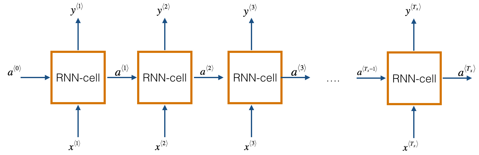
Humans can easily detect and identify objects present in an image. The human visual system is fast and accurate and can perform complex tasks like identifying multiple objects and detect obstacles with little conscious thought. With the availability of large amounts of data, faster GPUs, and better algorithms, we can now easily train computers to detect and classify multiple objects within an image with high accuracy. In this blog, we will explore terms such as object detection, object localization, loss function for object detection and localization, and finally explore an object detection algorithm known as “You only look once” (YOLO).

Object Localization

An image classification or image recognition model simply detect the probability of an object in an image. In contrast to this, object localization refers to identifying the location of an object in the image. An object localization algorithm will output the coordinates of the location of an object with respect to the image. In computer vision, the most popular way to localize an object in an image is to represent its location with the help of bounding boxes. Fig. 1 shows an example of a bounding box.

bounding box, object detection, localization, self driving cars, computer vision, deep learning, classfication
Fig 1. Bounding box representation used for object localization

A bounding box can be initialized using the following parameters:

  • bx, by : coordinates of the center of the bounding box
  • bw : width of the bounding box w.r.t the image width
  • bh : height of the bounding box w.r.t the image height

Defining the target variable

The target variable for a multi-class image classification problem is defined as:

Loss Function

Since we have defined both the target variable and the loss function, we can now use neural networks to both classify and localize objects.

Machine learning challenge, ML challenge

Object Detection

An approach to building an object detection is to first build a classifier that can classify closely cropped images of an object. Fig 2. shows an example of such a model, where a model is trained on a dataset of closely cropped images of a car and the model predicts the probability of an image being a car.

object detection, localization, self driving cars, computer vision, deep learning, classification
Fig 2. Image classification of cars

Now, we can use this model to detect cars using a sliding window mechanism. In a sliding window mechanism, we use a sliding window (similar to the one used in convolutional networks) and crop a part of the image in each slide. The size of the crop is the same as the size of the sliding window. Each cropped image is then passed to a ConvNet model (similar to the one shown in Fig 2.), which in turn predicts the probability of the cropped image is a car.

Fig 3. Sliding windows mechanism

After running the sliding window through the whole image, we resize the sliding window and run it again over the image again. We repeat this process multiple times. Since we crop through a number of images and pass it through the ConvNet, this approach is both computationally expensive and time-consuming, making the whole process really slow. Convolutional implementation of the sliding window helps resolve this problem.

Convolutional implementation of sliding windows

Before we discuss the implementation of the sliding window using convents, let’s analyze how we can convert the fully connected layers of the network into convolutional layers. Fig. 4 shows a simple convolutional network with two fully connected layers each of shape (400, ).

convolutional sliding window, sliding window, 1d convolution, yolo, object detection
Fig 4. Sliding windows mechanism

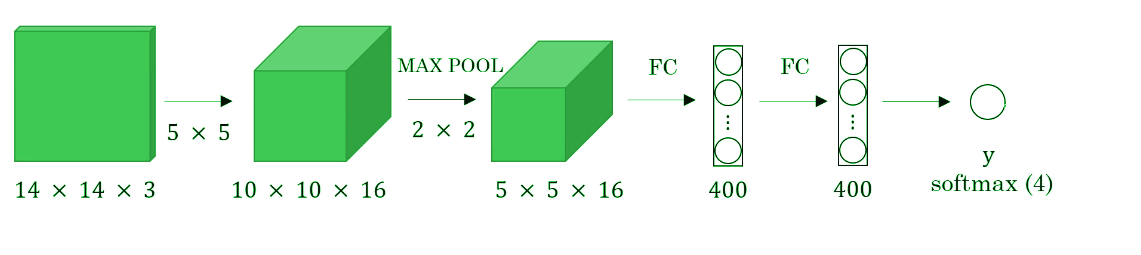
A fully connected layer can be converted to a convolutional layer with the help of a 1D convolutional layer. The width and height of this layer are equal to one and the number of filters are equal to the shape of the fully connected layer. An example of this is shown in Fig 5.

full connected layer to 1d convolution, 1 d convolution, full connected layers, dense layers
Fig 5. Converting a fully connected layer into a convolutional layer

We can apply this concept of conversion of a fully connected layer into a convolutional layer to the model by replacing the fully connected layer with a 1-D convolutional layer. The number of the filters of the 1D convolutional layer is equal to the shape of the fully connected layer. This representation is shown in Fig 6. Also, the output softmax layer is also a convolutional layer of shape (1, 1, 4), where 4 is the number of classes to predict.

full convolutional networks , converting dense layers to convolutional layers, computer vision, object detection, object localization
Fig 6. Convolutional representation of fully connected layers.

Now, let’s extend the above approach to implement a convolutional version of sliding window. First, let’s consider the ConvNet that we have trained to be in the following representation (no fully connected layers).

object detection, localization, self driving cars, computer vision, deep learning, classification

Let’s assume the size of the input image to be 16× 16× 3. If we’re to use a sliding window approach, then we would have passed this image to the above ConvNet four times, where each time the sliding window crops a part of the input image of size 14× 14× 3 and pass it through the ConvNet. But instead of this, we feed the full image (with shape 16× 16 × 3) directly into the trained ConvNet (see Fig. 7). This results in an output matrix of shape 2 × 2 × 4. Each cell in the output matrix represents the result of a possible crop and the classified value of the cropped image. For example, the left cell of the output (the green one) in Fig. 7 represents the result of the first sliding window. The other cells represent the results of the remaining sliding window operations.

Convolutional sliding window, fully convolutional network, sliding window, object detection, object localization, yolo, rcnn, computer vision, perception, self driving cars
Fig 7. Convolutional implementation of the sliding window

Note that the stride of the sliding window is decided by the number of filters used in the Max Pool layer. In the example above, the Max Pool layer has two filters, and as a result, the sliding window moves with a stride of two resulting in four possible outputs. The main advantage of using this technique is that the sliding window runs and computes all values simultaneously. Consequently, this technique is really fast. Although a weakness of this technique is that the position of the bounding boxes is not very accurate.

The YOLO (You Only Look Once) Algorithm

A better algorithm that tackles the issue of predicting accurate bounding boxes while using the convolutional sliding window technique is the YOLO algorithm. YOLO stands for you only look once and was developed in 2015 by Joseph Redmon, Santosh Divvala, Ross Girshick, and Ali Farhadi. It’s popular because it achieves high accuracy while running in real time. This algorithm is called so because it requires only one forward propagation pass through the network to make the predictions.

The algorithm divides the image into grids and runs the image classification and localization algorithm (discussed under object localization) on each of the grid cells. For example, we have an input image of size 256 × 256. We place a 3× 3 grid on the image (see Fig. 8).

YOLO algorithm, you only look once, Joseph Redmon, Computer vision, pattern recognition, Real time object detection
Fig. 8 Grid (3 x 3) representation of the image

Next, we apply the image classification and localization algorithm on each grid cell. For each grid cell, the target variable is defined as

Do everything once with the convolution sliding window. Since the shape of the target variable for each grid cell is 1 × 9 and there are 9 (3 × 3) grid cells, the final output of the model will be:

YOLO algorithm, you only look once, Joseph Redmon, Computer vision, pattern recognition, Real time object detection

The advantages of the YOLO algorithm is that it is very fast and predicts much more accurate bounding boxes. Also, in practice to get more accurate predictions, we use a much finer grid, say 19 × 19, in which case the target output is of the shape 19 × 19 × 9.

Conclusion

With this, we come to the end of the introduction to object detection. We now have a better understanding of how we can localize objects while classifying them in an image. We also learned to combine the concept of classification and localization with the convolutional implementation of the sliding window to build an object detection system. In the next blog, we will go deeper into the YOLO algorithm, loss function used, and implement some ideas that make the YOLO algorithm better. Also, we will learn to implement the YOLO algorithm in real time.

Have anything to say? Feel free to comment below for any questions, suggestions, and discussions related to this article. Till then, keep hacking with HackerEarth.

Data Visualization for Beginners-Part 3

Bonjour! Welcome to another part of the series on data visualization techniques. In the previous two articles, we discussed different data visualization techniques that can be applied to visualize and gather insights from categorical and continuous variables. You can check out the first two articles here:

In this article, we’ll go through the implementation and use of a bunch of data visualization techniques such as heat maps, surface plots, correlation plots, etc. We will also look at different techniques that can be used to visualize unstructured data such as images, text, etc.

 ### Importing the required libraries   
 import pandas as pd   
 import numpy as np  
 import seaborn as sns   
 import matplotlib.pyplot as plt   
 import plotly.plotly as py  
 import plotly.graph_objs as go  
 %matplotlib inline  

Heatmaps

A heat map(or heatmap) is a two-dimensional graphical representation of the data which uses colour to represent data points on the graph. It is useful in understanding underlying relationships between data values that would be much harder to understand if presented numerically in a table/ matrix.

### We can create a heatmap by simply using the seaborn library.   
 sample_data = np.random.rand(8, 12)  
 ax = sns.heatmap(sample_data)  
Heatmaps, seaborn, python, matplot, data visualization
Fig 1. Heatmap using the seaborn library

Let’s understand this using an example. We’ll be using the metadata from Deep Learning 3 challenge. Link to the dataset. Deep Learning 3 challenged the participants to predict the attributes of animals by looking at their images.

 ### Training metadata contains the name of the image and the corresponding attributes associated with the animal in the image.  
 train = pd.read_csv('meta-data/train.csv')  
 train.head()  

We will be analyzing how often an attribute occurs in relationship with the other attributes. To analyze this relationship, we will compute the co-occurrence matrix.

 ### Extracting the attributes  
 cols = list(train.columns)  
 cols.remove('Image_name')  
 attributes = np.array(train[cols])  
 print('There are {} attributes associated with {} images.'.format(attributes.shape[1],attributes.shape[0]))  
 Out: There are 85 attributes associated with 12,600 images.  
 # Compute the co-occurrence matrix  
 cooccurrence_matrix = np.dot(attributes.transpose(), attributes)  
 print('\n Co-occurrence matrix: \n', cooccurrence_matrix)  
 Out: Co-occurrence matrix:   
  [[5091 728 797 ... 3797 728 2024]  
  [ 728 1614  0 ... 669 1614 1003]  
  [ 797  0 1188 ... 1188  0 359]  
  ...  
  [3797 669 1188 ... 8305 743 3629]  
  [ 728 1614  0 ... 743 1933 1322]  
  [2024 1003 359 ... 3629 1322 6227]]  
 # Normalizing the co-occurrence matrix, by converting the values into a matrix  
 # Compute the co-occurrence matrix in percentage  
 #Reference:https://stackoverflow.com/questions/20574257/constructing-a-co-occurrence-matrix-in-python-pandas/20574460  
 cooccurrence_matrix_diagonal = np.diagonal(cooccurrence_matrix)  
 with np.errstate(divide = 'ignore', invalid='ignore'):  
   cooccurrence_matrix_percentage = np.nan_to_num(np.true_divide(cooccurrence_matrix, cooccurrence_matrix_diagonal))  
 print('\n Co-occurrence matrix percentage: \n', cooccurrence_matrix_percentage)  

We can see that the values in the co-occurrence matrix represent the occurrence of each attribute with the other attributes. Although the matrix contains all the information, it is visually hard to interpret and infer from the matrix. To counter this problem, we will use heat maps, which can help relate the co-occurrences graphically.

 fig = plt.figure(figsize=(10, 10))  
 sns.set(style='white')  
 # Draw the heatmap with the mask and correct aspect ratio   
 ax = sns.heatmap(cooccurrence_matrix_percentage, cmap='viridis', center=0, square=True, linewidths=0.15, cbar_kws={"shrink": 0.5, "label": "Co-occurrence frequency"}, )  
 ax.set_title('Heatmap of the attributes')  
 ax.set_xlabel('Attributes')  
 ax.set_ylabel('Attributes')  
 plt.show()  
Heatmap, data visualization, python, co occurence, seaborn
Fig 2. Heatmap of the co-occurrence matrix indicating the frequency of occurrence of one attribute with other

Since the frequency of the co-occurrence is represented by a colour pallet, we can now easily interpret which attributes appear together the most. Thus, we can infer that these attributes are common to most of the animals.

Machine learning challenge, ML challenge

Choropleth

Choropleths are a type of map that provides an easy way to show how some quantity varies across a geographical area or show the level of variability within a region. A heat map is similar but doesn’t include geographical boundaries. Choropleth maps are also appropriate for indicating differences in the distribution of the data over an area, like ownership or use of land or type of forest cover, density information, etc. We will be using the geopandas library to implement the choropleth graph.

We will be using choropleth graph to visualize the GDP across the globe. Link to the dataset.

 # Importing the required libraries  
 import geopandas as gpd   
 from shapely.geometry import Point  
 from matplotlib import cm  
 # GDP mapped to the corresponding country and their acronyms  
 df =pd.read_csv('GDP.csv')  
 df.head()  
COUNTRY GDP (BILLIONS) CODE
0 Afghanistan 21.71 AFG
1 Albania 13.40 ALB
2 Algeria 227.80 DZA
3 American Samoa 0.75 ASM
4 Andorra 4.80 AND
### Importing the geometry locations of each country on the world map  
 geo = gpd.read_file(gpd.datasets.get_path('naturalearth_lowres'))[['iso_a3', 'geometry']]  
 geo.columns = ['CODE', 'Geometry']  
 geo.head()  
# Mapping the country codes to the geometry locations  
 df = pd.merge(df, geo, left_on='CODE', right_on='CODE', how='inner')  
 #converting the dataframe to geo-dataframe  
 geometry = df['Geometry']  
 df.drop(['Geometry'], axis=1, inplace=True)  
 crs = {'init':'epsg:4326'}  
 geo_gdp = gpd.GeoDataFrame(df, crs=crs, geometry=geometry)  
 ## Plotting the choropleth  
 cpleth = geo_gdp.plot(column='GDP (BILLIONS)', cmap=cm.Spectral_r, legend=True, figsize=(8,8))  
 cpleth.set_title('Choropleth Graph - GDP of different countries')  
choropleth maps, choropleth graphs, data visualization techniques, python, big data, machine learning
Fig 3. Choropleth graph indicating the GDP according to geographical locations

Surface plot

Surface plots are used for the three-dimensional representation of the data. Rather than showing individual data points, surface plots show a functional relationship between a dependent variable (Z) and two independent variables (X and Y).

It is useful in analyzing relationships between the dependent and the independent variables and thus helps in establishing desirable responses and operating conditions.

 from mpl_toolkits.mplot3d import Axes3D  
 from matplotlib.ticker import LinearLocator, FormatStrFormatter  
 # Creating a figure  
 # projection = '3d' enables the third dimension during plot  
 fig = plt.figure(figsize=(10,8))  
 ax = fig.gca(projection='3d')  
 # Initialize data   
 X = np.arange(-5,5,0.25)  
 Y = np.arange(-5,5,0.25)  
 # Creating a meshgrid  
 X, Y = np.meshgrid(X, Y)  
 R = np.sqrt(np.abs(X**2 - Y**2))  
 Z = np.exp(R)  
 # plot the surface   
 surf = ax.plot_surface(X, Y, Z, cmap=cm.GnBu, antialiased=False)  
 # Customize the z axis.  
 ax.zaxis.set_major_locator(LinearLocator(10))  
 ax.zaxis.set_major_formatter(FormatStrFormatter('%.02f'))  
 ax.set_title('Surface Plot')  
 # Add a color bar which maps values to colors.  
 fig.colorbar(surf, shrink=0.5, aspect=5)  
 plt.show()  

One of the main applications of surface plots in machine learning or data science is the analysis of the loss function. From a surface plot, we can analyze how the hyperparameters affect the loss function and thus help prevent overfitting of the model.

python, 3d plot, machine learning, data visualization, machine learning, loss function, gradient descent, big data
Fig 4. Surface plot visualizing the dependent variable w.r.t the independent variables in 3-dimensions

Visualizing high-dimensional datasets

Dimensionality refers to the number of attributes present in the dataset. For example, consumer-retail datasets can have a vast amount of variables (e.g. sales, promos, products, open, etc.). As a result, visually exploring the dataset to find potential correlations between variables becomes extremely challenging.

Therefore, we use a technique called dimensionality reduction to visualize higher dimensional datasets. Here, we will focus on two such techniques :

  • Principal Component Analysis (PCA)
  • T-distributed Stochastic Neighbor Embedding (t-SNE)

Principal Component Analysis (PCA)

Before we jump into understanding PCA, let’s review some terms:

  • Variance: Variance is simply the measure of the spread or extent of the data. Mathematically, it is the average squared deviation from the mean position.varaince, PCA, prinicipal component analysis
  • Covariance: Covariance is the measure of the extent to which corresponding elements from two sets of ordered data move in the same direction. It is the measure of how two random variables vary together. It is similar to variance, but where variance tells you the extent of one variable, covariance tells you the extent to which the two variables vary together. Mathematically, it is defined as:

A positive covariance means X and Y are positively related, i.e., if X increases, Y increases, while negative covariance means the opposite relation. However, zero variance means X and Y are not related.

PCA, Principal Component Analysis , dimension reduction, python, machine learning, big data, image classification
Fig 5. Different types of covariance

PCA is the orthogonal projection of data onto a lower-dimension linear space that maximizes variance (green line) of the projected data and minimizes the mean squared distance between the data point and the projects (blue line). The variance describes the direction of maximum information while the mean squared distance describes the information lost during projection of the data onto the lower dimension.

Thus, given a set of data points in a d-dimensional space, PCA projects these points onto a lower dimensional space while preserving as much information as possible.

 principal component analysis, machine learning, dimension reduction technqieus, data visualization techniques, deep learning, ICA, PCA
Fig 6. Illustration of principal component analysis

In the figure, the component along the direction of maximum variance is defined as the first principal axis. Similarly, the component along the direction of second maximum variance is defined as the second principal component, and so on. These principal components are referred to the new dimensions carrying the maximum information.

 # We will use the breast cancer dataset as an example  
 # The dataset is a binary classification dataset  
 # Importing the dataset  
 from sklearn.datasets import load_breast_cancer  
 data = load_breast_cancer()  
 X = pd.DataFrame(data=data.data, columns=data.feature_names) # Features   
 y = data.target # Target variable   
 # Importing PCA function  
 from sklearn.decomposition import PCA  
 pca = PCA(n_components=2) # n_components = number of principal components to generate  
 # Generating pca components from the data  
 pca_result = pca.fit_transform(X)  
 print("Explained variance ratio : \n",pca.explained_variance_ratio_)  
 Out: Explained variance ratio :   
  [0.98204467 0.01617649]  

We can see that 98% (approx) variance of the data is along the first principal component, while the second component only expresses 1.6% (approx) of the data.

 # Creating a figure   
 fig = plt.figure(1, figsize=(10, 10))  
 # Enabling 3-dimensional projection   
 ax = fig.gca(projection='3d')  
 for i, name in enumerate(data.target_names):  
   ax.text3D(np.std(pca_result[:, 0][y==i])-i*500 ,np.std(pca_result[:, 1][y==i]),0,s=name, horizontalalignment='center', bbox=dict(alpha=.5, edgecolor='w', facecolor='w'))  
 # Plotting the PCA components    
 ax.scatter(pca_result[:,0], pca_result[:, 1], c=y, cmap = plt.cm.Spectral,s=20, label=data.target_names)  
 plt.show()  
PCA, principal component analysis, pca, ica, higher dimension data, dimension reduction techniques, data visualization of higher dimensions
Fig 7. Visualizing the distribution of cancer across the data

Thus, with the help of PCA, we can get a visual perception of how the labels are distributed across given data (see Figure).

T-distributed Stochastic Neighbour Embedding (t-SNE)

T-distributed Stochastic Neighbour Embeddings (t-SNE) is a non-linear dimensionality reduction technique that is well suited for visualization of high-dimensional data. It was developed by Laurens van der Maten and Geoffrey Hinton. In contrast to PCA, which is a mathematical technique, t-SNE adopts a probabilistic approach.

PCA can be used for capturing the global structure of the high-dimensional data but fails to describe the local structure within the data. Whereas, “t-SNE” is capable of capturing the local structure of the high-dimensional data very well while also revealing global structure such as the presence of clusters at several scales. t-SNE converts the similarity between data points to joint probabilities and tries to maximize the Kullback-Leibler divergence between the joint probabilities of the low-dimensional embeddings and high-dimension data. In doing so, it preserves the original structure of the data.

 # We will be using the scikit learn library to implement t-SNE  
 # Importing the t-SNE library   
 from sklearn.manifold import TSNE  
 # We will be using the iris dataset for this example  
 from sklearn.datasets import load_iris  
 # Loading the iris dataset   
 data = load_iris()  
 # Extracting the features   
 X = data.data  
 # Extracting the labels   
 y = data.target  
 # There are four features in the iris dataset with three different labels.  
 print('Features in iris data:\n', data.feature_names)  
 print('Labels in iris data:\n', data.target_names)  
 Out: Features in iris data:  
  ['sepal length (cm)', 'sepal width (cm)', 'petal length (cm)', 'petal width (cm)']  
 Labels in iris data:  
  ['setosa' 'versicolor' 'virginica']  
 # Loading the TSNE model   
 # n_components = number of resultant components   
 # n_iter = Maximum number of iterations for the optimization.  
 tsne_model = TSNE(n_components=3, n_iter=2500, random_state=47)  
 # Generating new components   
 new_values = tsne_model.fit_transform(X)  
 labels = data.target_names  
 # Plotting the new dimensions/ components  
 fig = plt.figure(figsize=(5, 5))  
 ax = Axes3D(fig, rect=[0, 0, .95, 1], elev=48, azim=134)  
 for label, name in enumerate(labels):  
   ax.text3D(new_values[y==label, 0].mean(),  
        new_values[y==label, 1].mean() + 1.5,  
        new_values[y==label, 2].mean(), name,  
        horizontalalignment='center',  
        bbox=dict(alpha=.5, edgecolor='w', facecolor='w'))  
 ax.scatter(new_values[:,0], new_values[:,1], new_values[:,2], c=y)  
 ax.set_title('High-Dimension data visualization using t-SNE', loc='right')  
 plt.show()  
Iris data set, Tsne, data visualization of words, data visualization techniques, dimension reduction techniques, higher dimension data
Fig 8. Visualizing the feature space of the iris dataset using t-SNE

Thus, by reducing the dimensions using t-SNE, we can visualize the distribution of the labels over the feature space. We can see that in the figure the labels are clustered in their own little group. So, if we’re to use a clustering algorithm to generate clusters using the new features/components, we can accurately assign new points to a label.

Conclusion

Let’s quickly summarize the topics we covered. We started with the generation of heatmaps using random numbers and extended its application to a real-world example. Next, we implemented choropleth graphs to visualize the data points with respect to geographical locations. We moved on to implement surface plots to get an idea of how we can visualize the data in a three-dimensional surface. Finally, we used two- dimensional reduction techniques, PCA and t-SNE, to visualize high-dimensional datasets.

I encourage you to implement the examples described in this article to get a hands-on experience. Hope you enjoyed the article. Do let me know if you have any feedback, suggestions, or thoughts on this article in the comments below!

Composing Jazz Music with Deep Learning

Deep Learning is on the rise, extending its application in every field, ranging from computer vision to natural language processing, healthcare, speech recognition, generating art, addition of sound to silent movies, machine translation, advertising, self-driving cars, etc. In this blog, we will extend the power of deep learning to the domain of music production. We will talk about how we can use deep learning to generate new musical beats.

The current technological advancements have transformed the way we produce music, listen, and work with music. With the advent of deep learning, it has now become possible to generate music without the need for working with instruments artists may not have had access to or the skills to use previously. This offers artists more creative freedom and ability to explore different domains of music.

Recurrent Neural Networks

Since music is a sequence of notes and chords, it doesn’t have a fixed dimensionality. Traditional deep neural network techniques cannot be applied to generate music as they assume the inputs and targets/outputs to have fixed dimensionality and outputs to be independent of each other. It is therefore clear that a domain-independent method that learns to map sequences to sequences would be useful.

Recurrent neural networks (RNNs) are a class of artificial neural networks that make use of sequential information present in the data.

recurrent neural network, deep learning, character based learning,
Fig. 1 A basic RNN unit.

A recurrent neural network has looped, or recurrent, connections which allow the network to hold information across inputs. These connections can be thought of as memory cells. In other words, RNNs can make use of information learned in the previous time step. As seen in Fig. 1, the output of the previous hidden/activation layer is fed into the next hidden layer. Such an architecture is efficient in learning sequence-based data.

In this blog, we will be using the Long Short-Term Memory (LSTM) architecture. LSTM is a type of recurrent neural network (proposed by Hochreiter and Schmidhuber, 1997) that can remember a piece of information and keep it saved for many timesteps.

Dataset

Our dataset includes piano tunes stored in the MIDI format. MIDI (Musical Instrument Digital Interface) is a protocol which allows electronic instruments and other digital musical tools to communicate with each other. Since a MIDI file only represents player information, i.e., a series of messages like ‘note on’, ‘note off, it is more compact, easy to modify, and can be adapted to any instrument.

Before we move forward, let us understand some music related terminologies:

  • Note: A note is either a single sound or its representation in notation. Each note consist of pitch, octave, and an offset.
  • Pitch: Pitch refers to the frequency of the sound.
  • Octave: An octave is the interval between one musical pitch and another with half or double its frequency.
  • Offset: Refers to the location of the note.
  • Chord: Playing multiple notes at the same time constitutes a chord.

Data Preprocessing

We will use the music21 toolkit (a toolkit for computer-aided musicology, MIT) to extract data from these MIDI files.

  1. Notes Extraction

     def get_notes():  
         notes = []  
         for file in songs:  
           # converting .mid file to stream object  
           midi = converter.parse(file)  
           notes_to_parse = []  
           try:  
             # Given a single stream, partition into a part for each unique instrument  
             parts = instrument.partitionByInstrument(midi)  
           except:  
             pass  
           if parts: # if parts has instrument parts   
             notes_to_parse = parts.parts[0].recurse()  
           else:  
             notes_to_parse = midi.flat.notes  
           for element in notes_to_parse:   
             if isinstance(element, note.Note):  
               # if element is a note, extract pitch   
               notes.append(str(element.pitch))  
             elif(isinstance(element, chord.Chord)):  
               # if element is a chord, append the normal form of the   
               # chord (a list of integers) to the list of notes.   
               notes.append('.'.join(str(n) for n in element.normalOrder))  
         with open('data/notes', 'wb') as filepath:  
           pickle.dump(notes, filepath)  
         return notes  
      

    The function get_notes returns a list of notes and chords present in the .mid file. We use the converter.parse function to convert the midi file in a stream object, which in turn is used to extract notes and chords present in the file. The list returned by the function get_notes() looks as follows:

     Out:  
         ['F2', '4.5.7', '9.0', 'C3', '5.7.9', '7.0', 'E4', '4.5.8', '4.8', '4.8', '4', 'G#3',  
         'D4', 'G#3', 'C4', '4', 'B3', 'A2', 'E3', 'A3', '0.4', 'D4', '7.11', 'E3', '0.4.7', 'B4', 'C3', 'G3', 'C4', '4.7', '11.2', 'C3', 'C4', '11.2.4', 'G4', 'F2', 'C3', '0.5', '9.0', '4.7', 'F2', '4.5.7.9.0', '4.8', 'F4', '4', '4.8', '2.4', 'G#3',  
        '8.0', 'E2', 'E3', 'B3', 'A2', '4.9', '0.4', '7.11', 'A2', '9.0.4', ...........]  

    We can see that the list consists of pitches and chords (represented as a list of integers separated by a dot). We assume each new chord to be a new pitch on the list. As letters are used to generate words in a sentence, similarly the music vocabulary used to generate music is defined by the unique pitches in the notes list.

  2. Generating Input and Output Sequences

    A neural network accepts only real values as input and since the pitches in the notes list are in string format, we need to map each pitch in the notes list to an integer. We can do so as follows:

     # Extract the unique pitches in the list of notes.   
       pitchnames = sorted(set(item for item in notes))  
       # create a dictionary to map pitches to integers  
       note_to_int = dict((note, number) for number, note in enumerate(pitchnames))  
      

    Next, we will create an array of input and output sequences to train our model. Each input sequence will consist of 100 notes, while the output array stores the 101st note for the corresponding input sequence. So, the objective of the model will be to predict the 101st note of the input sequence of notes.

     # create input sequences and the corresponding outputs  
       for i in range(0, len(notes) - sequence_length, 1):  
         sequence_in = notes[i: i + sequence_length]  
         sequence_out = notes[i + sequence_length]  
         network_input.append([note_to_int[char] for char in sequence_in])  
         network_output.append(note_to_int[sequence_out])  
      

    Next, we reshape and normalize the input vector sequence before feeding it to the model. Finally, we one-hot encode our output vector.

     n_patterns = len(network_input)  
       # reshape the input into a format compatible with LSTM layers   
       network_input = np.reshape(network_input, (n_patterns, sequence_length, 1))  
       # normalize input  
       network_input = network_input / float(n_vocab)  
       # One hot encode the output vector  
       network_output = np_utils.to_categorical(network_output)  
      

Model Architecture

Machine learning challenge, ML challenge

We will use keras to build our model architecture. We use a character level-based architecture to train the model. So each input note in the music file is used to predict the next note in the file, i.e., each LSTM cell takes the previous layer activation (a⟨t−1⟩) and the previous layers actual output (y⟨t−1⟩) as input at the current time step tt. This is depicted in the following figure (Fig 2.).

LSTM, Long term short architecture, Recurrent neural network, music generation, neural network,
Fig 2. One to Many LSTM architecture

Our model architecture is defined as:

 model = Sequential()  
   model.add(LSTM(128, input_shape=network_in.shape[1:], return_sequences=True))  
   model.add(Dropout(0.2))  
   model.add(LSTM(128, return_sequences=True))  
   model.add(Flatten())  
   model.add(Dense(256))  
   model.add(Dropout(0.3))  
   model.add(Dense(n_vocab))  
   model.add(Activation('softmax'))  
   model.compile(loss='categorical_crossentropy', optimizer='adam')  
  

Our music model consists of two LSTM layers with each layer consisting of 128 hidden layers. We use ‘categorical cross entropy‘ as the loss function and ‘adam‘ as the optimizer. Fig. 3 shows the model summary.

LSTM, Long short term memory, model architecture, music generation, rnn, recurrent neural netowrk
Fig 3. Model summary

Model Training

To train the model, we call the model.fit function with the input and output sequences as the input to the function. We also create a model checkpoint which saves the best model weights.

 from keras.callbacks import ModelCheckpoint  
   def train(model, network_input, network_output, epochs):   
     """  
     Train the neural network  
     """  
     filepath = 'weights.best.music3.hdf5'  
     checkpoint = ModelCheckpoint(filepath, monitor='loss', verbose=0, save_best_only=True)  
     model.fit(network_input, network_output, epochs=epochs, batch_size=32, callbacks=[checkpoint])  
   def train_network():  
     epochs = 200  
     notes = get_notes()  
     print('Notes processed')  
     n_vocab = len(set(notes))  
     print('Vocab generated')  
     network_in, network_out = prepare_sequences(notes, n_vocab)  
     print('Input and Output processed')  
     model = create_network(network_in, n_vocab)  
     print('Model created')  
     return model  
     print('Training in progress')  
     train(model, network_in, network_out, epochs)  
     print('Training completed')  
  

The train_network method gets the notes, creates the input and output sequences, creates a model, and trains the model for 200 epochs.

Music Sample Generation

Now that we have trained our model, we can use it to generate some new notes. To generate new notes, we need a starting note. So, we randomly pick an integer and pick a random sequence from the input sequence as a starting point.

 def generate_notes(model, network_input, pitchnames, n_vocab):  
     """ Generate notes from the neural network based on a sequence of notes """  
     # Pick a random integer  
     start = np.random.randint(0, len(network_input)-1)  
     int_to_note = dict((number, note) for number, note in enumerate(pitchnames))  
     # pick a random sequence from the input as a starting point for the prediction  
     pattern = network_input[start]  
     prediction_output = []  
     print('Generating notes........')  
     # generate 500 notes  
     for note_index in range(500):  
       prediction_input = np.reshape(pattern, (1, len(pattern), 1))  
       prediction_input = prediction_input / float(n_vocab)  
       prediction = model.predict(prediction_input, verbose=0)  
       # Predicted output is the argmax(P(h|D))  
       index = np.argmax(prediction)  
       # Mapping the predicted interger back to the corresponding note  
       result = int_to_note[index]  
       # Storing the predicted output  
       prediction_output.append(result)  
       pattern.append(index)  
       # Next input to the model  
       pattern = pattern[1:len(pattern)]  
     print('Notes Generated...')  
     return prediction_output  
  

Next, we use the trained model to predict the next 500 notes. At each time step, the output of the previous layer (ŷ⟨t−1⟩) is provided as input (x⟨t⟩) to the LSTM layer at the current time step t. This is depicted in the following figure (see Fig. 4).

sampling, sampling from rnn, LSTM, architecture, music sampling, music generation
Fig 4. Sampling from a trained network.

Since the predicted output is an array of probabilities, we choose the output at the index with the maximum probability. Finally, we map this index to the actual note and add this to the list of predicted output. Since the predicted output is a list of strings of notes and chords, we cannot play it. Hence, we encode the predicted output into the MIDI format using the create_midi method.

 ### Converts the predicted output to midi format  
   create_midi(prediction_output)  
  

To create some new jazz music, you can simply call the generate() method, which calls all the related methods and saves the predicted output as a MIDI file.

 #### Generate a new jazz music   
   generate()  
   Out:   
     Initiating music generation process.......  
     Loading Model weights.....  
     Model Loaded  
     Generating notes........  
     Notes Generated...  
     Saving Output file as midi....  
  

To play the generated MIDI in the Jupyter Notebook you can import the play_midi method from the play.py file or use an external MIDI player or convert the MIDI file to the mp3. Let’s listen to our generated jazz piano music.

 ### Play the Jazz music  
   play.play_midi('test_output3.mid')  
“Generated Track 1” Deep Learning Recurrent Neural Network
Audio Player

Conclusion

Congratulations! You can now generate your own jazz music. You can find the full code in this Github repository. I encourage you to play with the parameters of the model and train the model with input sequences of different sequence lengths. Try to implement the code for some other instrument (such as guitar). Furthermore, such a character-based model can also be applied to a text corpus to generate sample texts, such as a poem.

Also, you can showcase your own personal composer and any similar idea in the World Music Hackathonby HackerEarth.

Have anything to say? Feel free to comment below for any questions, suggestions, and discussions related to this article. Till then, happy coding.

Data visualization for beginners - Part 1

This is a series of blogs dedicated to different data visualization techniques used in various domains of machine learning. Data Visualization is a critical step for building a powerful and efficient machine learning model. It helps us to better understand the data, generate better insights for feature engineering, and, finally, make better decisions during modeling and training of the model.

For this blog, we will use the seaborn and matplotlib libraries to generate the visualizations. Matplotlib is a MATLAB-like plotting framework in python, while seaborn is a python visualization library based on matplotlib. It provides a high-level interface for producing statistical graphics. In this blog, we will explore different statistical graphical techniques that can help us in effectively interpreting and understanding the data. Although all the plots using the seaborn library can be built using the matplotlib library, we usually prefer the seaborn library because of its ability to handle DataFrames.

We will start by importing the two libraries. Here is the guide to installing the matplotlib library and seaborn library. (Note that I’ll be using matplotlib and seaborn libraries interchangeably depending on the plot.)

### Importing necessary library  
import random  
import numpy as np  
import pandas as pd  
import seaborn as sns  
import matplotlib.pyplot as plt  
%matplotlib inline  

Simple Plot

Let’s begin by plotting a simple line plot which is used to plot a mathematical. A line plot is used to plot the relationship or dependence of one variable on another. Say, we have two variables ‘x’ and ‘y’ with the following values:

x = np.array([ 0, 0.53, 1.05, 1.58, 2.11, 2.63, 3.16, 3.68, 4.21,  
        4.74, 5.26, 5.79, 6.32, 6.84])  
y = np.array([ 0, 0.51, 0.87, 1. , 0.86, 0.49, -0.02, -0.51, -0.88,  
        -1. , -0.85, -0.47, 0.04, 0.53])  

To plot the relationship between the two variables, we can simply call the plot function.

### Creating a figure to plot the graph.  
fig, ax = plt.subplots()  
ax.plot(x, y)  
ax.set_xlabel('X data')  
ax.set_ylabel('Y data')  
ax.set_title('Relationship between variables X and Y')  
plt.show() # display the graph  
### if %matplotlib inline has been invoked already, then plt.show() is automatically invoked and the plot is displayed in the same window.  
Data Visualization Technique: Simple Plot - Relationship between X&Y
Fig. 1. Line Plot between X and Y

Here, we can see that the variables ‘x’ and ‘y’ have a sinusoidal relationship. Generally, .plot() function is used to find any mathematical relationship between the variables.

Histogram

Machine learning challenge, ML challenge

A histogram is one of the most frequently used data visualization techniques in machine learning. It represents the distribution of a continuous variable over a given interval or period of time. Histograms plot the data by dividing it into intervals called ‘bins’. It is used to inspect the underlying frequency distribution (eg. Normal distribution), outliers, skewness, etc.

Let’s assume some data ‘x’ and analyze its distribution and other related features.

### Let 'x' be the data with 1000 random points.   
x = np.random.randn(1000)  

Let’s plot a histogram to analyze the distribution of ‘x’.

plt.hist(x)  
plt.xlabel('Intervals')  
plt.ylabel('Value')  
plt.title('Distribution of the variable x')  
plt.show()  
Data Visualization Techniques: Histogram of variable x
Fig 2. Histogram showing the distribution of the variable ‘x’.

The above plot shows a normal distribution, i.e., the variable ‘x’ is normally distributed. We can also infer that the distribution is somewhat negatively skewed. We usually control the ‘bins’ parameters to produce a distribution with smooth boundaries. For example, if we set the number of ‘bins’ too low, say bins=5, then most of the values get accumulated in the same interval, and as a result they produce a distribution which is hard to predict.

plt.hist(x, bins=5)  
plt.xlabel('Intervals')  
plt.ylabel('Value')  
plt.title('Distribution of the variable x')  
plt.show()  
Data Visualization Techniques: Histogram with low number of bins
Fig 3. Histogram with low number of bins.

Similarly, if we increase the number of ‘bins’ to a high value, say bins=1000, each value will act as a separate bin, and as a result the distribution seems to be too random.

plt.hist(x, bins=1000)  
plt.xlabel('Intervals')  
plt.ylabel('Value')  
plt.title('Distribution of the variable x')  
plt.show()  
Data Visualization Techniques: Histogram with low bins
Fig. 4. Histogram with a large number of bins.

Kernel Density Function

Before we dive into understanding KDE, let’s understand what parametric and non-parametric data are.

Parametric Data: When the data is assumed to have been drawn from a particular distribution and some parametric test can be applied to it

Non-Parametric Data: When we have no knowledge about the population and the underlying distribution

Kernel Density Function is the non-parametric way of representing the probability distribution function of a random variable. It is used when the parametric distribution of the data doesn’t make much sense, and you want to avoid making assumptions about the data.

The kernel density estimator is the estimated pdf of a random variable. It is defined as
Kernel density equation
Similar to histograms, KDE plots the density of observations on one axis with height along the other axis.

### We will use the seaborn library to plot KDE.  
### Let's assume random data stored in variable 'x'.  
fig, ax = plt.subplots()  
### Generating random data  
x = np.random.rand(200)   
sns.kdeplot(x, shade=True, ax=ax)  
plt.show()  
Data visualization using Kernel Density Function
Fig 5. KDE plot for the random variable ‘x’.

Distplot combines the function of the histogram and the KDE plot into one figure.

### Generating a random sample  
x = np.random.random_sample(1000)  
### Plotting the distplot  
sns.distplot(x, bins=20)  
Data Visualization: Distplot using seaborn
Fig 6. Displot for the random variable ‘x’.

So, the distplot function plots the histogram and the KDE for the sample data in the same figure. You can tune the parameters of the displot to only display the histogram or kde or both. Distplot comes in handy when you want to visualize how close your assumption about the distribution of the data is to the actual distribution.

Scatter Plot

Scatter plots are used to determine the relationship between two variables. They show how much one variable is affected by another. It is the most commonly used data visualization technique and helps in drawing useful insights when comparing two variables. The relationship between two variables is called correlation. If the data points fit a line or curve with a positive slope, then the two variables are said to show positive correlation. If the line or curve has a negative slope, then the variables are said to have a negative correlation.

A perfect positive correlation has a value of 1 and a perfect negative correlation has a value of -1. The closer the value is to 1 or -1, the stronger the relationship between the variables. The closer the value is to 0, the weaker the correlation.

For our example, let’s define three variables ‘x’, ‘y’, and ‘z’, where ‘x’ and ‘z’ are randomly generated data and ‘y’ is defined as
EquationWe will use a scatter plot to find the relationship between the variables ‘x’ and ‘y’.

### Let's define the variables we want to find the relationship between.  
x = np.random.rand(500)  
z = np.random.rand(500)  
### Defining the variable 'y'  
y = x * (z + x)  
fig, ax = plt.subplots()  
ax.set_xlabel('X')  
ax.set_ylabel('Y')  
ax.set_title('Scatter plot between X and Y')  
plt.scatter(x, y, marker='.')  
plt.show()  
Data Visualization: Scatter plot between X & Y
Fig 7. Scatter plot between X and Y.

From the figure above we can see that the data points are very close to each other and also if we fit a curve, along with the points, it will have a positive slope. Therefore, we can infer that there is a strong positive correlation between the values of the variable ‘x’ and variable ‘y’.

Also, we can see that the curve that best fits the graph is quadratic in nature and this can be confirmed by looking at the definition of the variable ‘y’.

Joint Plot

Jointplot is seaborn library specific and can be used to quickly visualize and analyze the relationship between two variables and describe their individual distributions on the same plot.

Let’s start with using joint plot for producing the scatter plot.

### Defining the data.   
mean, covar = [0, 1], [[1, 0,], [0, 50]]  
### Drawing random samples from a multivariate normal distribution.  
### Two random variables are created, each containing 500 values, with the given mean and covariance.  
data = np.random.multivariate_normal(mean, covar, 500)  
### Storing the variables in a dataframe.  
df = pd.DataFrame(data=data, columns=['X', 'Y'])  
### Joint plot between X and Y  
sns.jointplot(df.X, df.Y, kind='scatter')  
plt.show()  
Data Visualisation: Joint plot using seaborn
Fig 8. Joint plot (scatter plot) between X and Y.

Next, we can use the joint point to find the best line or curve that fits the plot.

sns.jointplot(df.X, df.Y, kind='reg')  
plt.show()  
Data visualization: Using joint plot for regression
Fig 9. Using joint plot to plot the regression line that best fits the data points.

Apart from this, jointplot can also be used to plot ‘kde’, ‘hex plot’, and ‘residual plot’.

PairPlot

We can use scatter plot to plot the relationship between two variables. But what if the dataset has more than two variables (which is quite often the case), it can be a tedious task to visualize the relationship between each variable with the other variables.

The seaborn pairplot function does the same thing for us and in just one line of code. It is used to plot multiple pairwise bivariate (two variable) distribution in a dataset. It creates a matrix and plots the relationship for each pair of columns. It also draws a univariate distribution for each variable on the diagonal axes.

### Loading a dataset from the sklearn toy datasets  
from sklearn.datasets import load_linnerud  
### Loading the data  
linnerud_data = load_linnerud()  
### Extracting the column data  
data = linnerud_data.data  

Sklearn stores data in the form of a numpy array and not data frames, thereby storing the data in a dataframe.

### Creating a dataframe  
data = pd.DataFrame(data=data, columns=diabetes_data.feature_names)  
### Plotting a pairplot  
sns.pairplot(data=data)  
Data visualization: Pair plot for relation between columns
Fig 10. Pair plot showing the relationships between the columns of the dataset.

So, in the graph above, we can see the relationships between each of the variables with the other and thus infer which variables are most correlated.

Conclusion

Visualizations play an important role in data analysis and exploration. In this blog, we got introduced to different kinds of plots used for data analysis of continuous variables. Next week, we will explore the various data visualization techniques that can be applied to categorical variables or variables with discrete values. Next, I encourage you to download the iris dataset or any other dataset of your choice and apply and explore the techniques learned in this blog.

Have anything to say? Feel free to comment below for any questions, suggestions, and discussions related to this article. Till then, Sayōnara.